Content Manager Documentation
This documentation showcases each component and the varieties that it’s able to achieve. Every component has its settings (colours, themes, font size, etc) that could be adjusted according to your needs.
P.S. Any theme that are not mentioned in this documentation is currently unused, unless they’re needed for future improvements. Choosing these themes won’t break the page - just produces plain style.

Banners
Banner - Theme 1
This is banner - theme 1.
Remember that even after you choose a theme, you can still style any banner sub-items (paragraph, buttons, background) however you need it to be, with the size and colors provided.
Banner - Theme 2
This is banner - theme 2. 50% (narrower) content, with sleek bottom border. Great for when you need a divider for the next section. And if the text appears smaller, maybe it’s because the paragraph is set into “small”. Try it yourself! 😃

Banner - Theme 3
This is banner - theme 3. This one also has 50% width in bigger screen. The difference with the theme 2 is that this one does not provide bottom divider.
Lorem ipsum dolor sit amet, consectetur adipiscing elit, sed do eiusmod tempor incididunt ut labore et dolore magna aliqua. Ut enim ad minim veniam, quis nostrud exercitation ullamco laboris nisi ut aliquip ex ea commodo consequat.
Content Blocks
Content Block - Theme 1
This is Content Block - Theme 1.
Content blocks are essentially contents in columnal layout. You can choose from two up to 5 columns, and all of them can be styled with any theme that you need. For example, this is theme 1.

Content Block - Theme 2

This is content block theme 2.
- Has narrower gaps from each column and to each item in the column
- Has wider gap to the section before and after
- Recommended to add column background color; it’s styled to have rounded corners
Please refer to other themes as a comparison.
Content Block - Theme 2
This is content block theme 2.
- Has narrower gaps from each column and to each item in the column
- Has wider gap to the section before and after
- Recommended to add column background color; it’s styled to have rounded corners
Please refer to other themes as a comparison.
Content Block - Theme 2
This is content block theme 2.
- Has narrower gaps from each column and to each item in the column
- Has wider gap to the section before and after
- Recommended to add column background color; it’s styled to have rounded corners
Please refer to other themes as a comparison.
Content Block - Theme 3

This is content block theme 3.
- Has wider gaps from each column and to each item in the column
- Has narrower gap to the section before and after
Please refer to other themes as a comparison.
Content Block - Theme 3
This is content block theme 3.
- Has wider gaps from each column and to each item in the column
- Has narrower gap to the section before and after
Please refer to other themes as a comparison.
Content Block - Theme 3
This is content block theme 3.
- Has wider gaps from each column and to each item in the column
- Has narrower gap to the section before and after
Please refer to other themes as a comparison.
Content Block - Theme 4
This is content block theme 4.
- Recommended to add column background color; it’s styled to have rounded corners (border style, not filled)
- Image will animate on hover when there’s link associated to it
Content Block - Theme 4
This is content block theme 4.
- Recommended to add column background color; it’s styled to have rounded corners (border style, not filled)
- Image will animate on hover when there’s link associated to it
Content Block - Theme 4
This is content block theme 4.
- Recommended to add column background color; it’s styled to have rounded corners (border style, not filled)
- Image will animate on hover when there’s link associated to it
Video in ContentBlock
Video in ContentBlock
Video in ContentBlock
Buttons
Buttons - Small Size
Buttons - Medium Size
Buttons - Large Size
Typography
Primary Color
Heading Extra Small
Heading Small
Heading Medium
Heading Large
Heading Extra Large
Secondary Color
Heading Extra Small
Heading Small
Heading Medium
Heading Large
Heading Extra Large
Accent Color
Heading Extra Small
Heading Small
Heading Medium
Heading Large
Heading Extra Large
And this is how a regular paragraph looks like. You can also adjust the sizing and the colors too, just like the heading ones.
This is extra small size, accent color
This is small size, primary color
This is medium size, secondary color
This is large size, accent color
This is extra large size, primary color
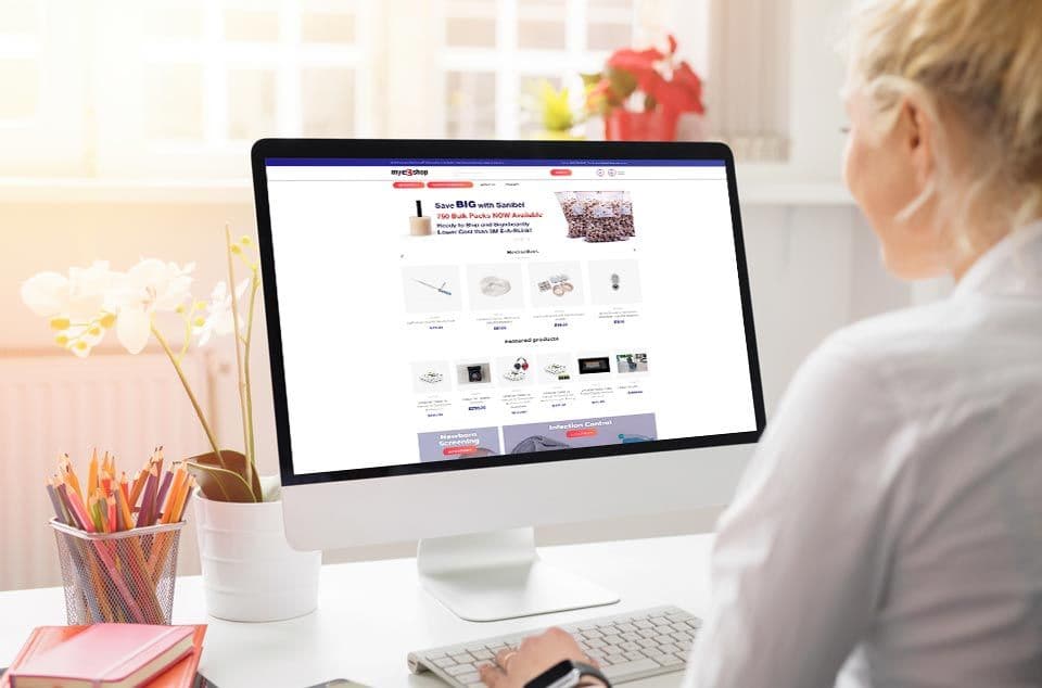
Product Cards Section
Product Cards - Theme 1
View All
Product Cards - Theme 2
View All
Article Cards Section (for Blogs)
Article Cards - Theme 1
View All

Collection Cards (for Employees)


Byron Gilmore
Service Technician

Amir Manocheh
Service Technician

Brian Ankrom
Service Technician

David Ellis
Service Technician

Kyle Pita
Service Technician
Office Locator
Our office locator section is configured to produce one search result only. Please send a request if you’d like otherwise.
Austin
507 Denali Pass, Ste 203
Cedar Park , TX 78613
Fax: (612) 355-4010
Phone: (952) 947-6096
Office Cards Section
Featured Offices
View MoreLos Angeles
909 S Tremont St
Oceanside, California CA 92054
United States of America
Phone: (800) 873-1222
Fax: (760) 435-1334
Visit the officeSan Diego
909 S Tremont St
Oceanside, California CA 92054
United States of America
Phone: (800) 873-1222
Fax: (760) 435-1334
Visit the officeTampa
1200 Starkey Rd, Ste 105
Largo, Florida FL 33771
United States of America
Phone: (800) 226-3277
Fax: (321) 269-1117
Visit the officeKansas City
11805 W 62nd Pl, Ste 110
Shawnee, Kansas KS 66203-2655
United States of America
Phone: (913) 831-0700
Fax: (913) 831-0417
Visit the officeForms
Form - Theme 1
- Plain form with minimal styling & config
Form - Theme 2
- This form has a configuration to make it collapse into a button on pageload
- Automatically applies secondary background color into it
- Right now the “Request A Quote” button is not customizable
Accordion
Ut enim ad minim veniam, quis nostrud exercitation ullamco laboris nisi ut aliquip ex ea commodo consequat.
- Sed ut perspiciatis unde omnis iste natus error sit voluptatem accusantium doloremque laudantium
- Totam rem aperiam, eaque ipsa quae ab illo inventore veritatis
- Et quasi architecto beatae vitae dicta sunt explicabo
Quis autem vel eum iure reprehenderit qui in ea voluptate velit esse quam nihil molestiae consequatur, vel illum qui dolorem eum fugiat quo voluptas nulla pariatur
- Nemo enim ipsam voluptatem quia voluptas sit aspernatur aut odit aut fugit, sed quia consequuntur magni dolores eos qui ratione voluptatem sequi nesciunt.
- Neque porro quisquam est, qui dolorem ipsum quia dolor sit amet, consectetur, adipisci velit, sed quia non numquam eius modi tempora incidunt ut labore et dolore magnam aliquam quaerat voluptatem.
- Ut enim ad minima veniam, quis nostrum exercitationem ullam corporis suscipit laboriosam, nisi ut aliquid ex ea commodi.
Yes you can. Just toggle to the “columns” option and choose “two”. Voila!
- Blanditiis praesentium voluptatum deleniti atque corrupti quos dolores et quas molestias
- Excepturi sint occaecati cupiditate non provident, similique sunt in culpa qui officia deserunt mollitia animi
- Id est laborum et dolorum fuga. Et harum quidem rerum facilis est et expedita distinctio
- Nam libero tempore, cum soluta nobis est eligendi optio cumque nihil
- Impedit quo minus id quod maxime placeat facere
Lorem ipsum dolor sit amet, consectetur adipiscing elit, sed do eiusmod tempor incididunt ut labore et dolore magna aliqua. Ut enim ad minim veniam, quis nostrud exercitation ullamco laboris nisi ut aliquip ex ea commodo consequat.
Duis aute irure dolor in reprehenderit in voluptate velit esse cillum dolore eu fugiat nulla pariatur. Excepteur sint occaecat cupidatat non proident, sunt in culpa qui officia deserunt mollit anim id est laborum.
- Sed ut perspiciatis unde omnis iste natus error sit voluptatem accusantium doloremque laudantium, totam rem aperiam, eaque ipsa quae ab illo inventore veritatis et quasi architecto beatae vitae dicta sunt explicabo. Nemo enim ipsam voluptatem quia voluptas sit aspernatur aut odit aut fugit
- Sed quia consequuntur magni dolores eos qui ratione voluptatem sequi nesciunt. Neque porro quisquam est, qui dolorem ipsum quia dolor sit amet, consectetur, adipisci velit, sed quia non numquam eius modi tempora incidunt ut labore et dolore magnam aliquam quaerat voluptatem